°C
& fine
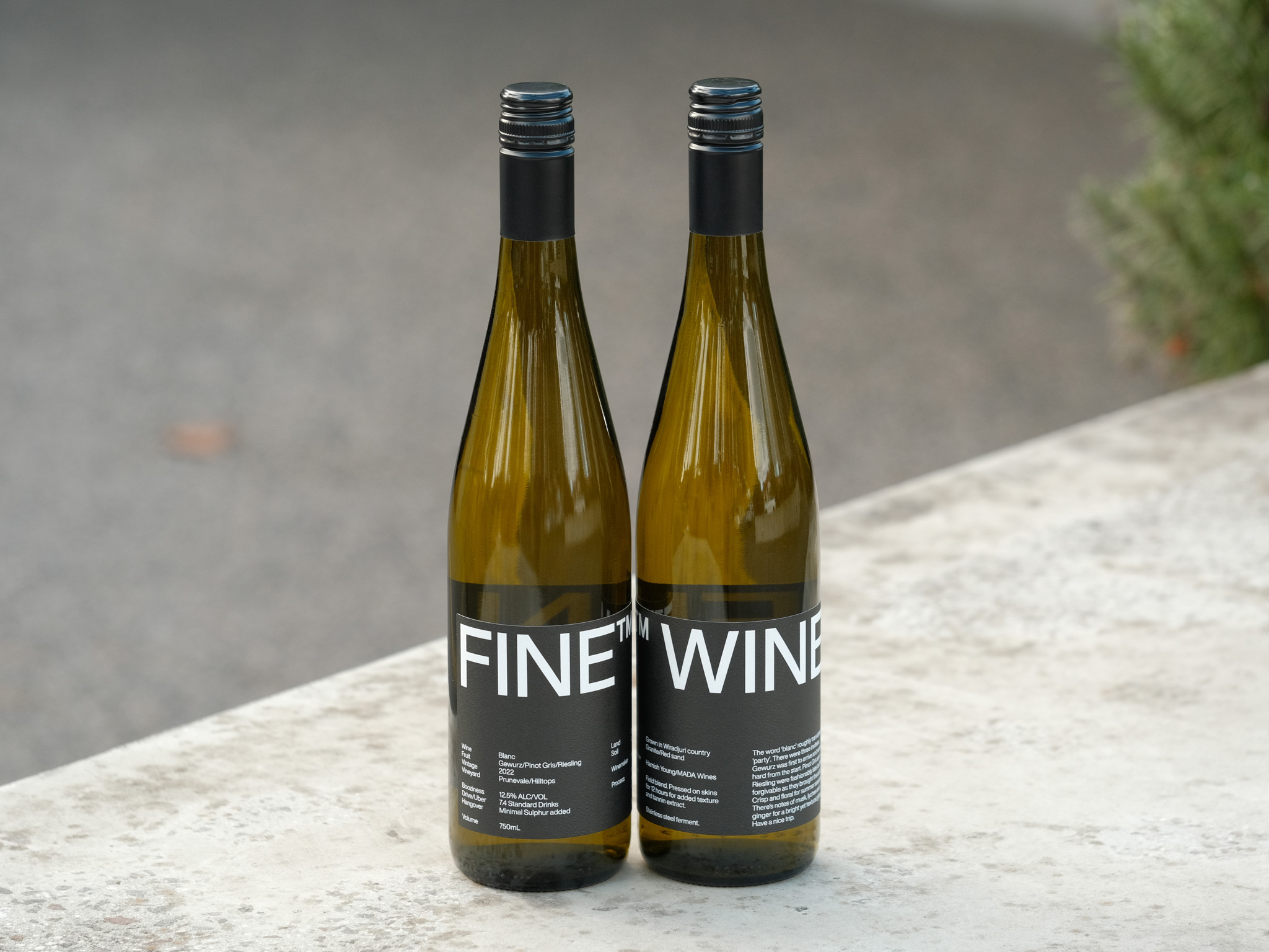
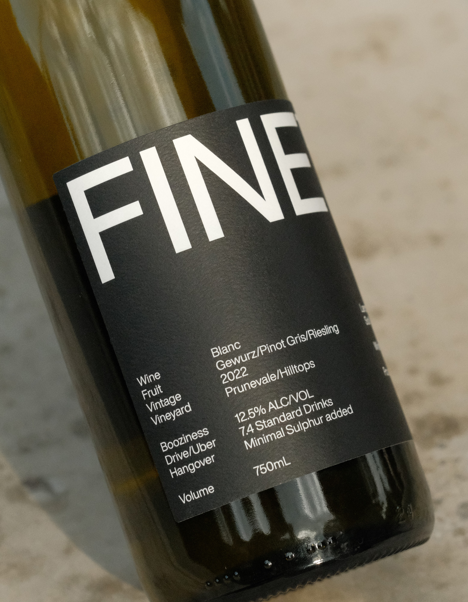
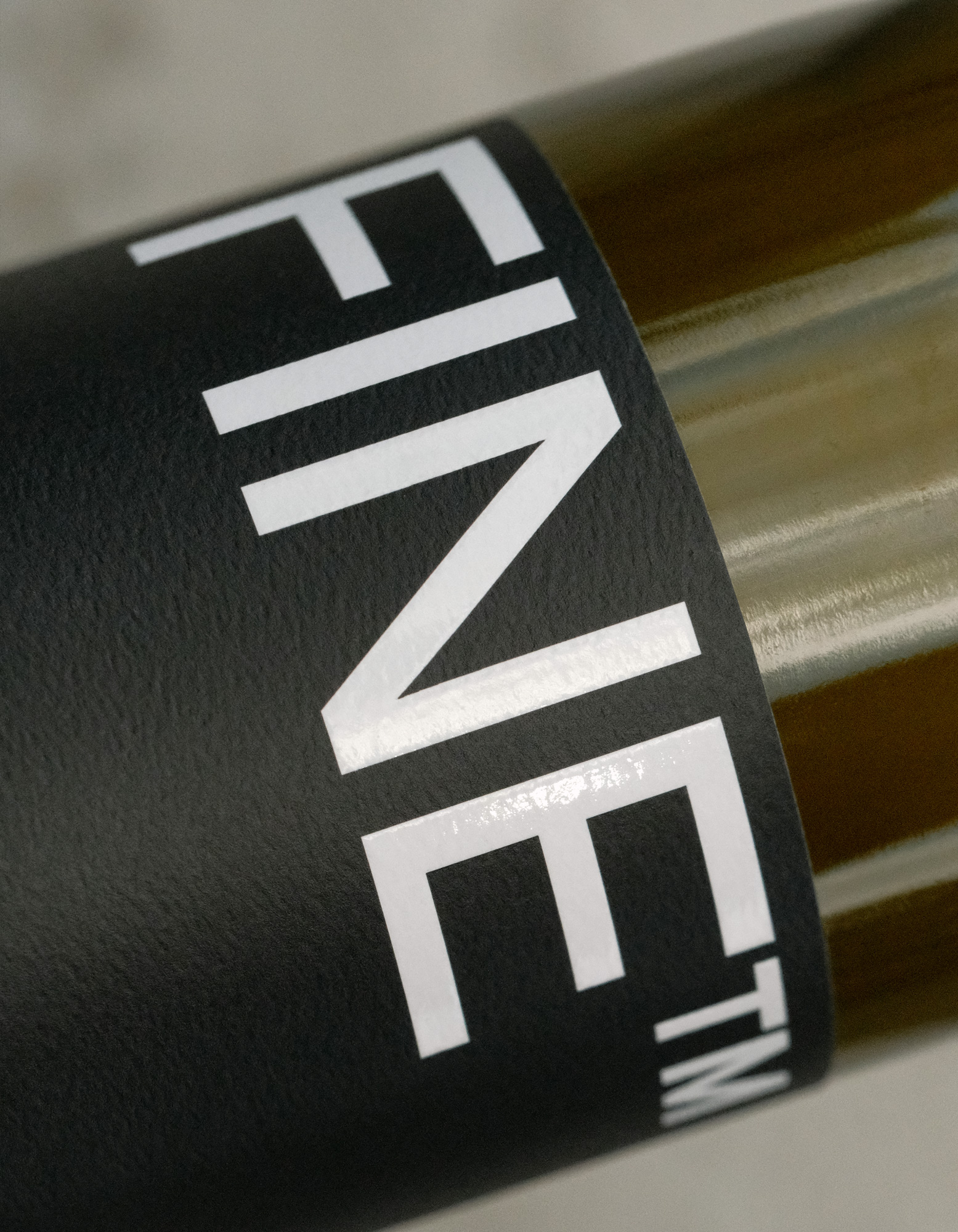
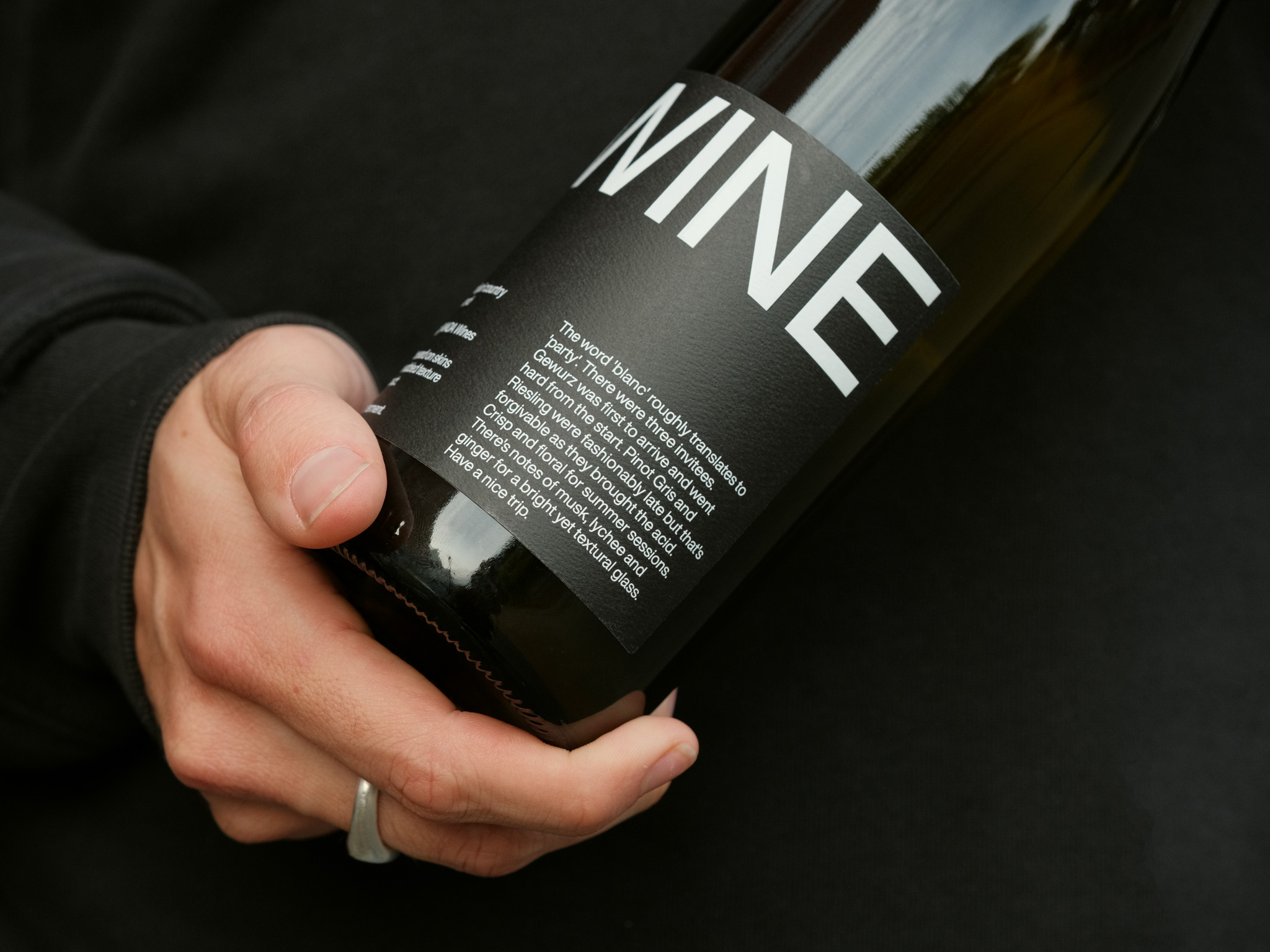
fine™
Essence
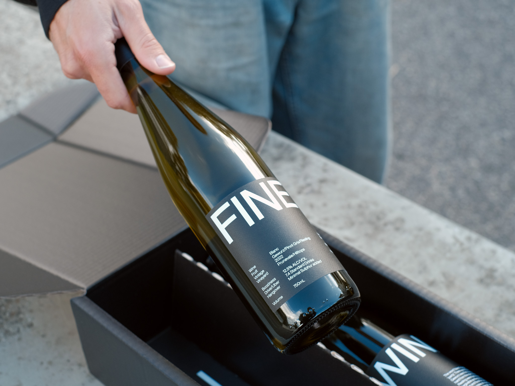
FINE WINE was either born from a deep-rooted passion for minimal intervention vino, or a somewhat hazy Friday afternoon where perhaps too much was consumed. You decide.
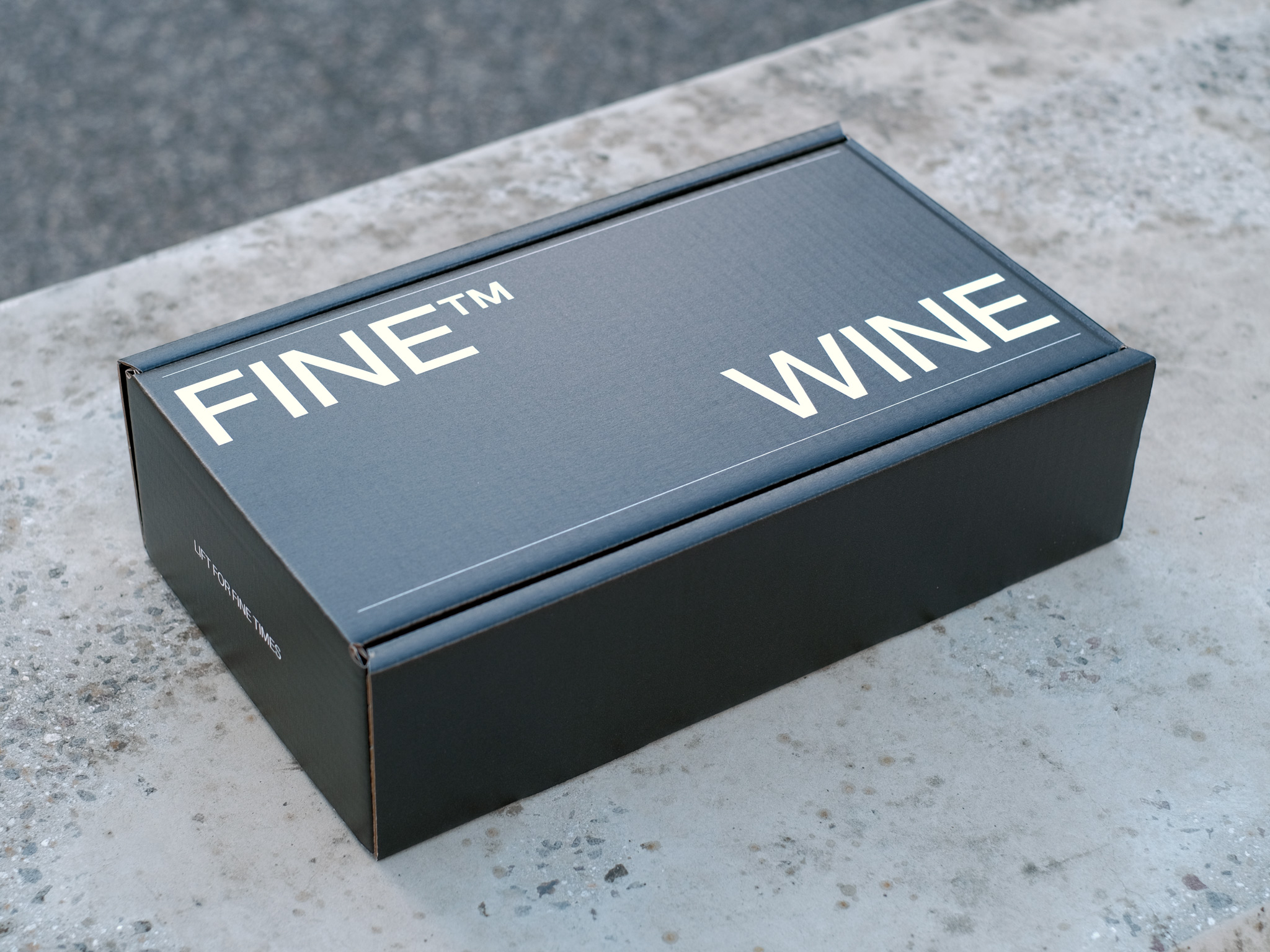
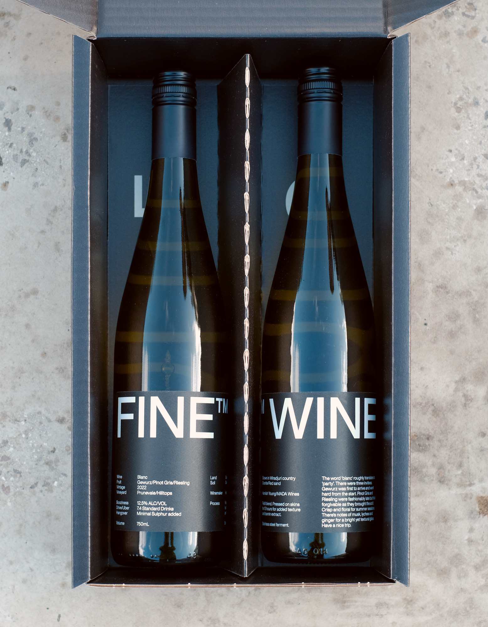
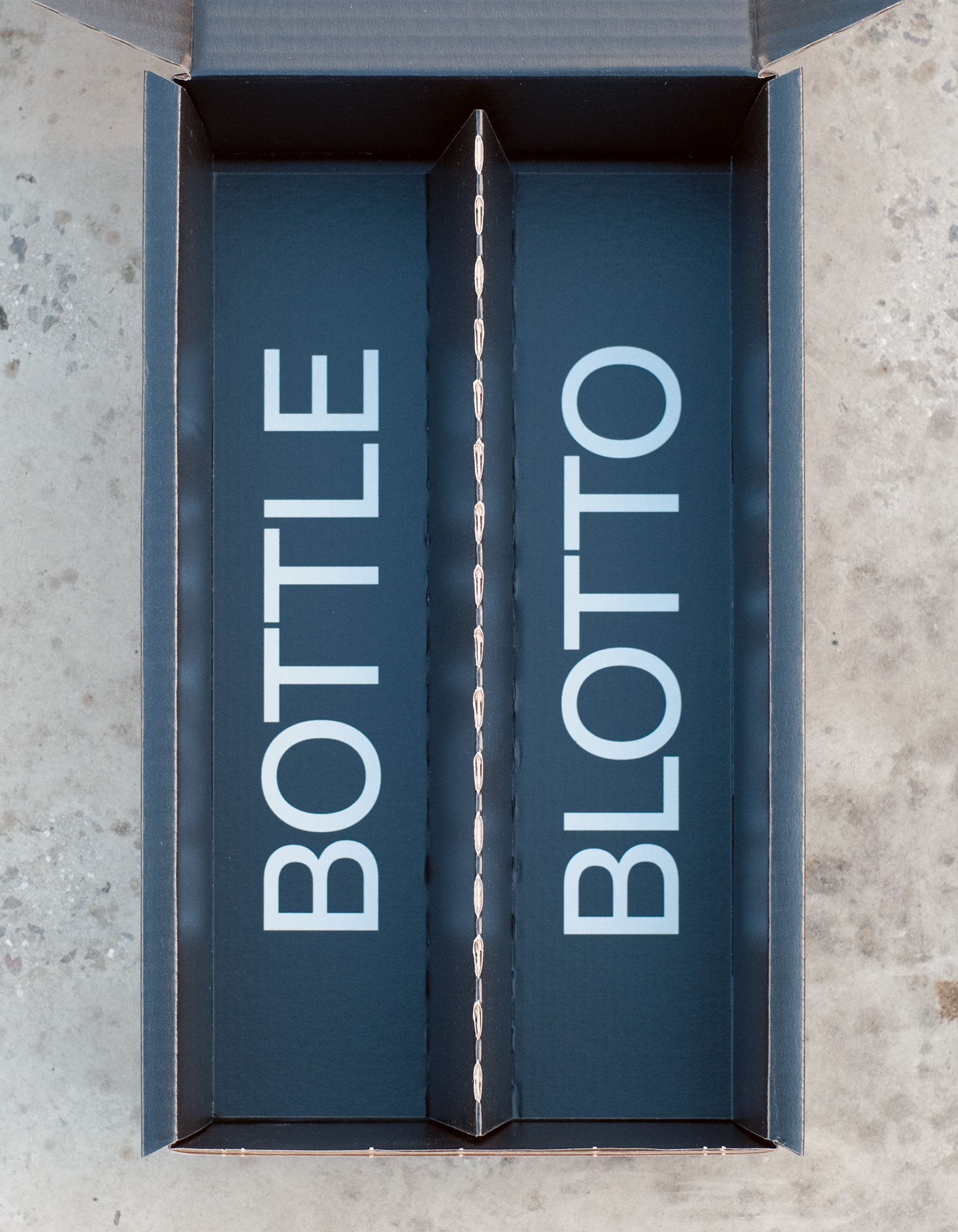
Either way we wanted to create an artefact that embodied our studio, our interests and our values. One that could strengthen the relationship others have with our own brand. To spark conversation, be gifted, or simply enjoyed mid-workshop.
It needed to showcase our love of typography, minimalism, and collaboration. A physical manifestation of our belief that every detail matters, highlighting the value of design and the power of copywriting to build connection.
Approach
Delivery
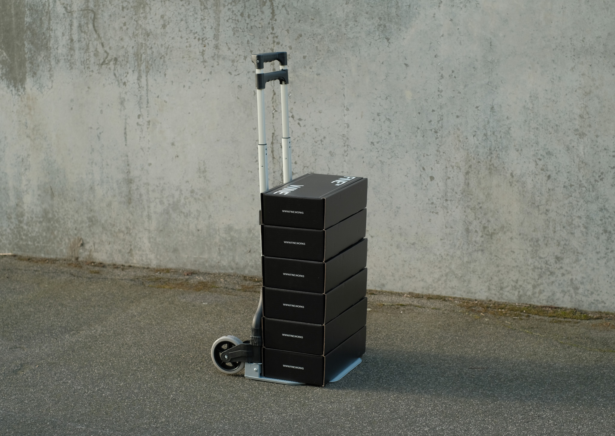
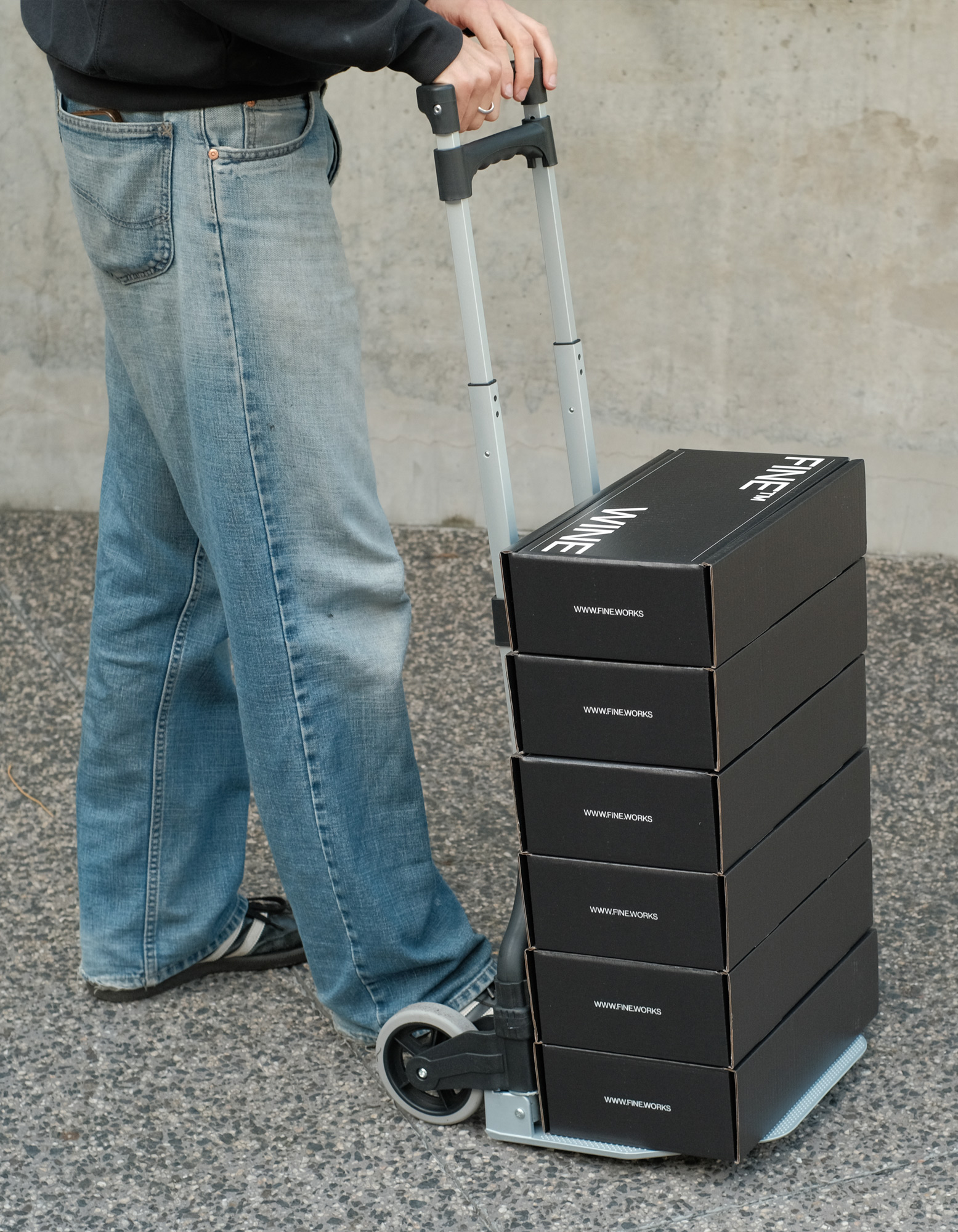
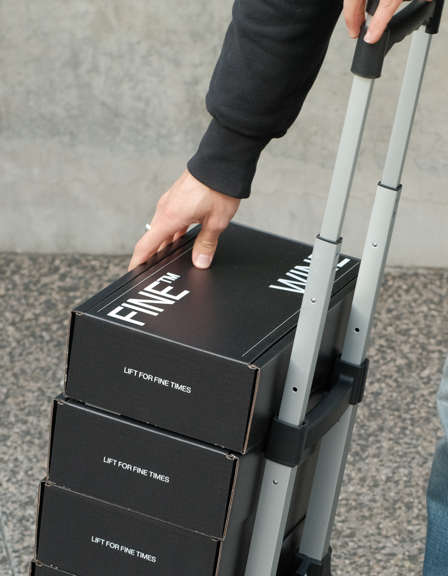
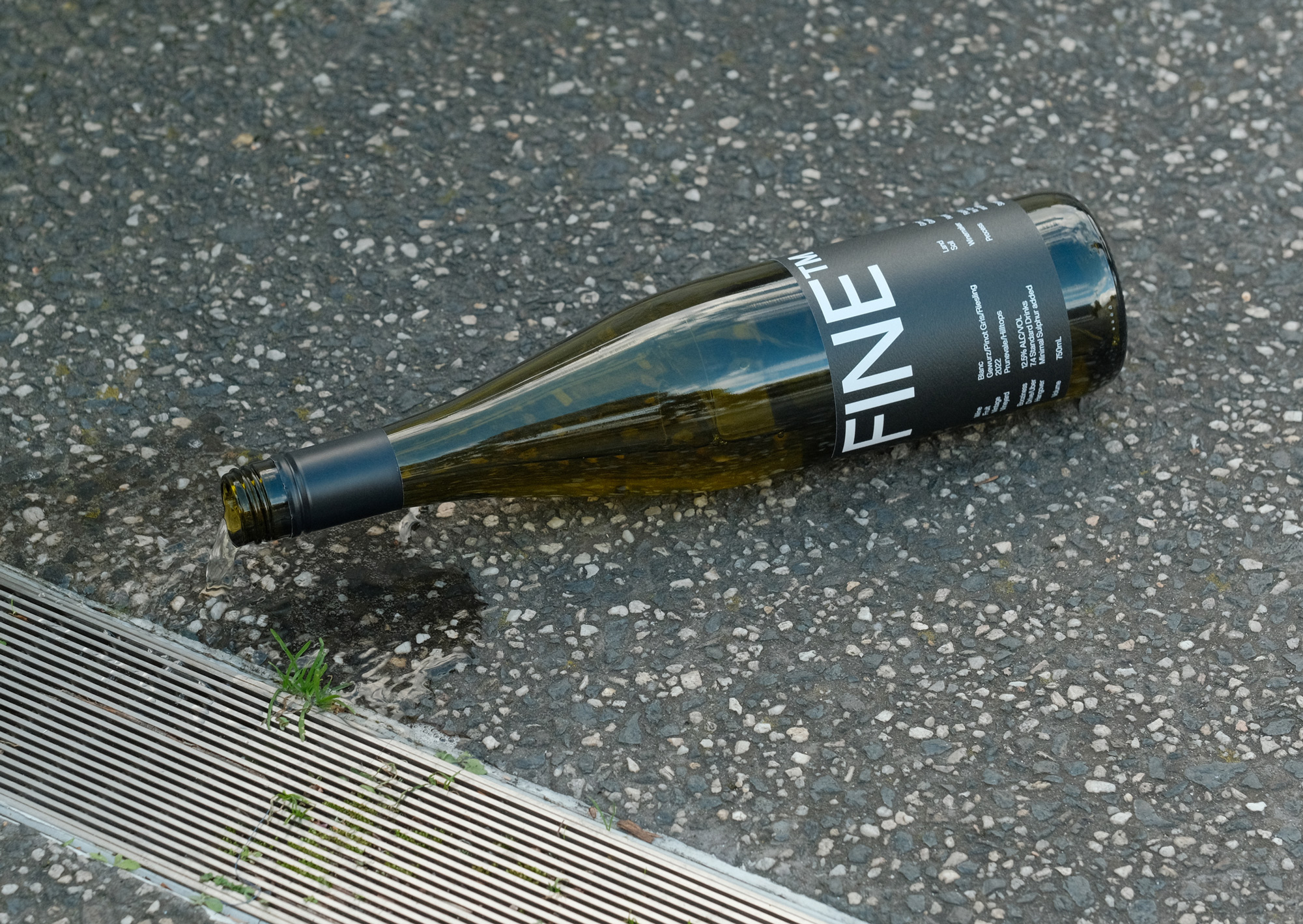
- Label Design
- Packaging Design